


Find out
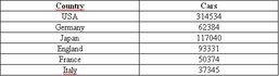
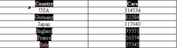
Excel allows you on to create charts using the data in a given worksheet. When using the Chart Wizard, you can choose from different types of charts and specify chart options. It is worth noting that some types of chart may require a re-arrangement of the data. For example, if you want to create a column, bar, line, area, surface or pie chart, your data must first be arranged simply in columns.
Or in rows:
If you want to create an XY (scatter) or bubble chart, arrange the X values in the first column and the corresponding Y values in adjacent columns.
After arranging the data in your worksheet, select the cells you want to use in the chart. To select cells that are not in a continuous range, select the first cells, press and hold down CTRL and select the additional cells. It is important that the non-adjacent selection of cells forms a rectangle.
The non-adjacent cells are treated as if they appear together.
Go to Insert|Chart or click the Chart Wizard button  in the toolbar and follow the instructions in the Chart Wizard. You can create different types of charts, e.g. with figures:
... or with percentages: