Depending on the culture, fonts and font families are used more or less often and in different text types or text parts, e.g.:
- Serif fonts like "Times Roman" are preferred in English manuals
- Sans serif fonts such as "Helvetica" are preferred in German manuals
Typographic elements such as segments used for text ordering can also be culture-specific, for example:
- Dashes ("-") are preferred for lists in German, and
- Bullets ("•") are preferred for lists in English
Other typographical elements such as capitalization are used for emphasizing. In cultures or languages where this is not possible (e.g. German, because all nouns are always capitalized), elements such as font size, font weight, underlining, etc. can be used to avoid information loss (cf. Schmitz, 2005a:14). For more information about fonts and cultures and for free font click here .
Using Fonts
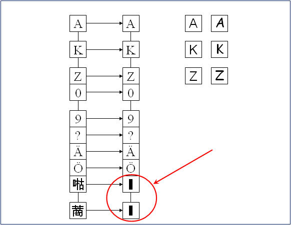
Regarding the use of fonts, it is important for translators/localisers to know that fonts have to fit together with the character sets used. If a font does not support a specific character set, the information will not be displayed properly, as shown in the following example:
Missing fonts (Graphic taken from Sachse, 2005:151)


